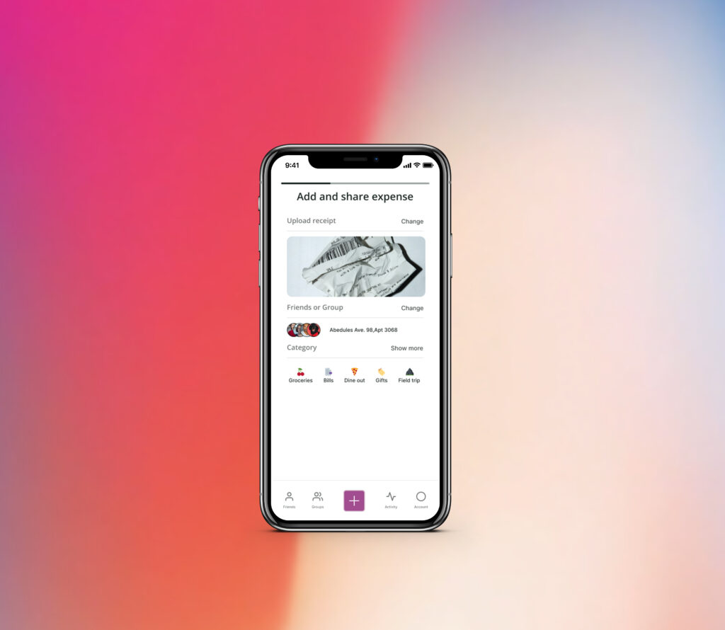
Improve adding, categorising and sharing expenses flow in SplitWise app.
Based on qualitative research I improved adding expenses and categorising flow on the SplitWise.
Role
UX Research
Tagging Taxonomy and Affinity Mapping
Benchmarking of Competitors
IA
Wireframing
UI Design
Tools
Google Forms
Dovetail
Figjam
Figma
Loom
Timeline
6 weeks
Survey
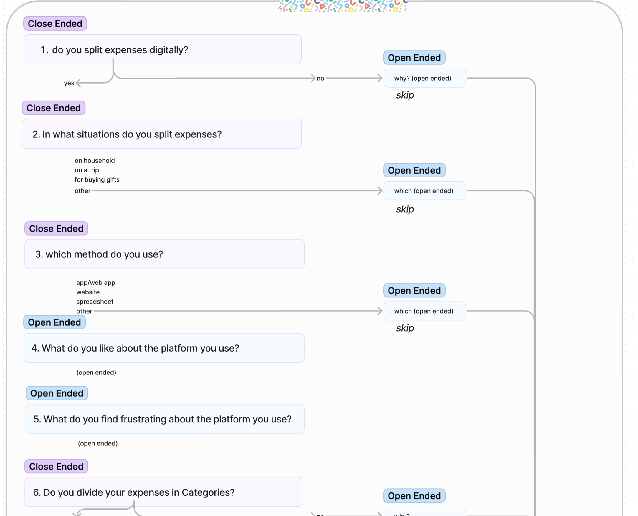
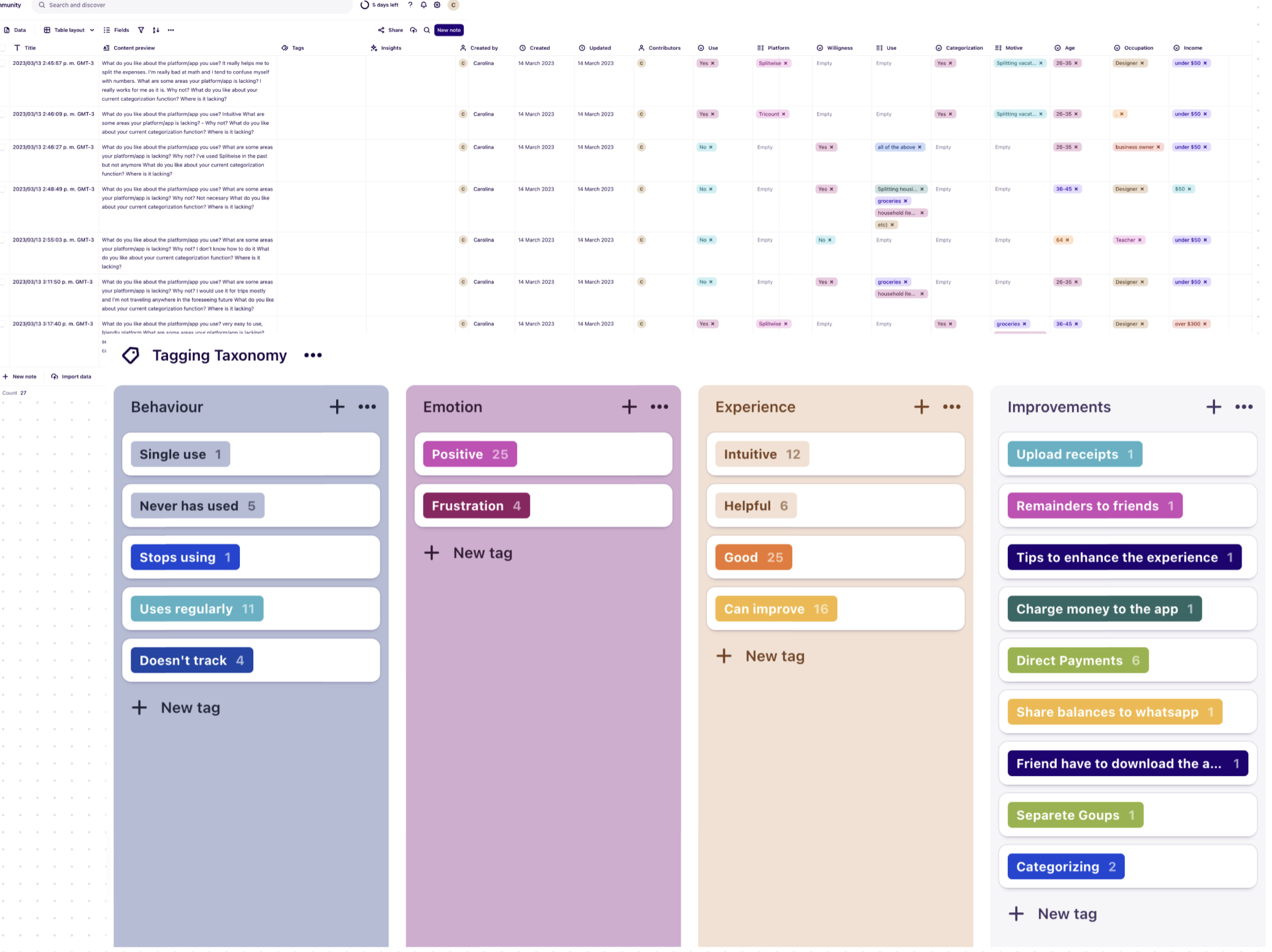
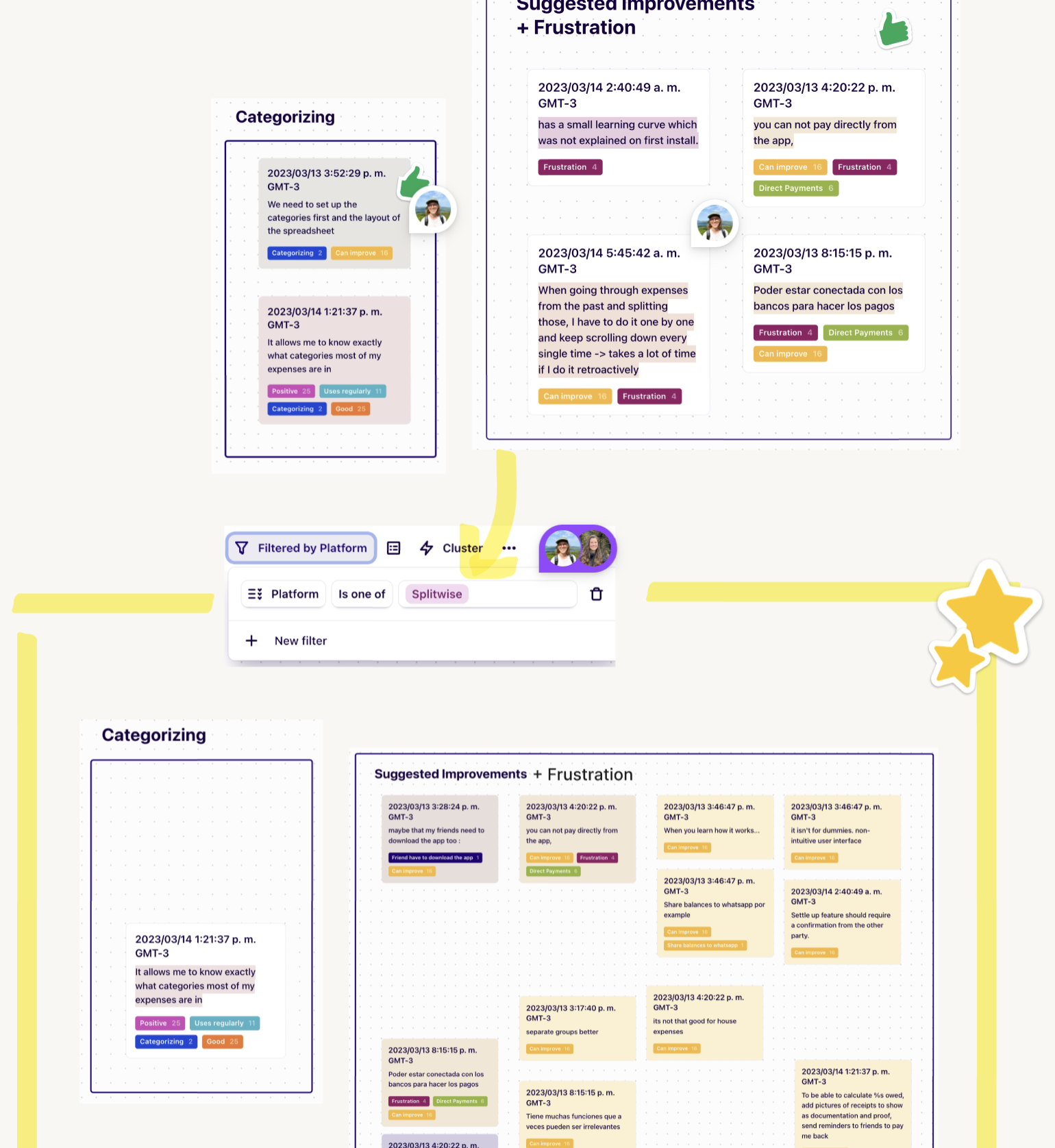
In order to get a better understanding on how the user interacts with SplitWise app we conducted a qualitative usability review survey using google forms. We added the survey results to Dovetail and created a tagging taxonomy to identify trends. Later we organized those trends with affinity mapping and we got to prioritise what was the main pain points or strong points of our user’s experience within SplitWise.
Business & User frustrations
How Splitwise can introduce categorisation to their expenses product and improve the visual design of accurately reflecting who paid for what within a group experience.
Primary Frustration:
When an expense is shared you cannot pay within the app. Users have to exit and go to their bank apps/website to pay their debts, which results in a time consuming operation leading users to prefer other methods for tracking expenses.
Secondary Frustration:
When sharing expenses users are wait to be paid and the app doesn’t offer to send remainders which results in an unsatisfying result.
Competitor Benchmarking
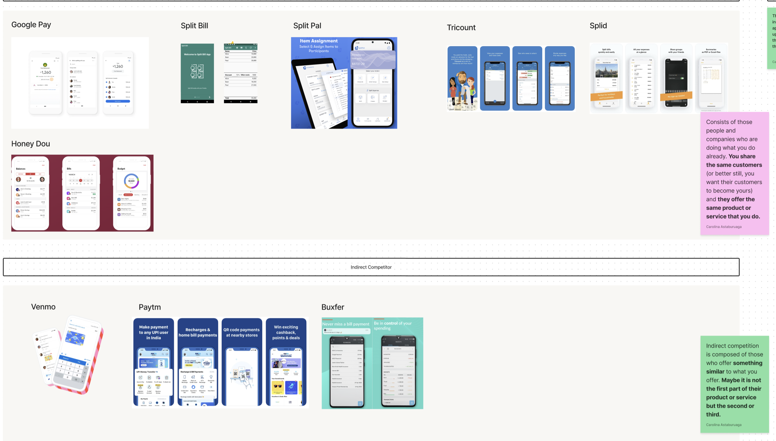
We reviewed a direct competitor to discover the opportunities in their product and find ways to capitalize, giving our client’s app the best chance at success.
Observing features and user flows in a few indirect competitors gave us inspiration for ways to adapt the current experience to benefit our client’s products and meet their business goals.
Ideation
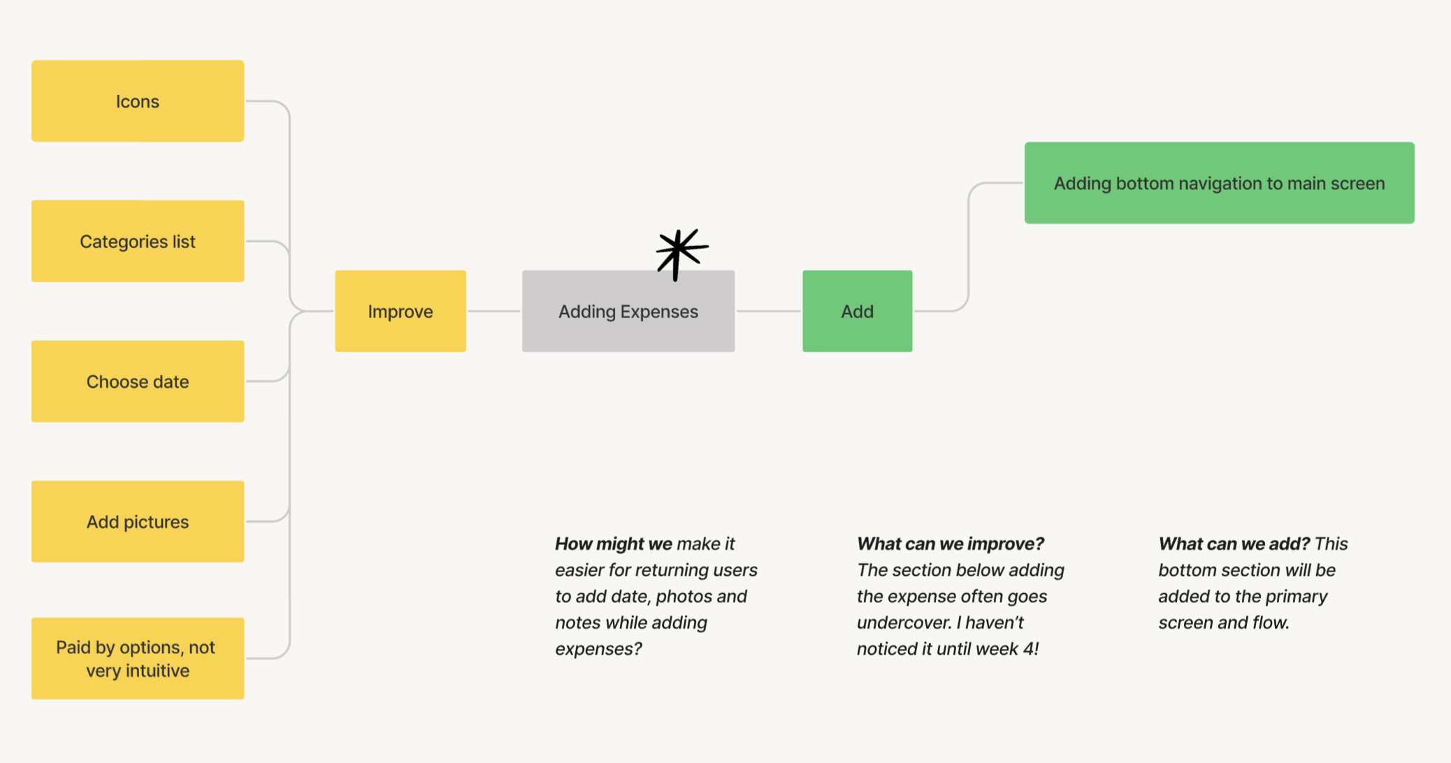
How might we make it easier for returning users to add date, photos and notes while adding expenses.
Que could improve the section below adding the expense that ofter goes undercover.
This bottom section will be added to the primary screen and flow.
Information Architecture
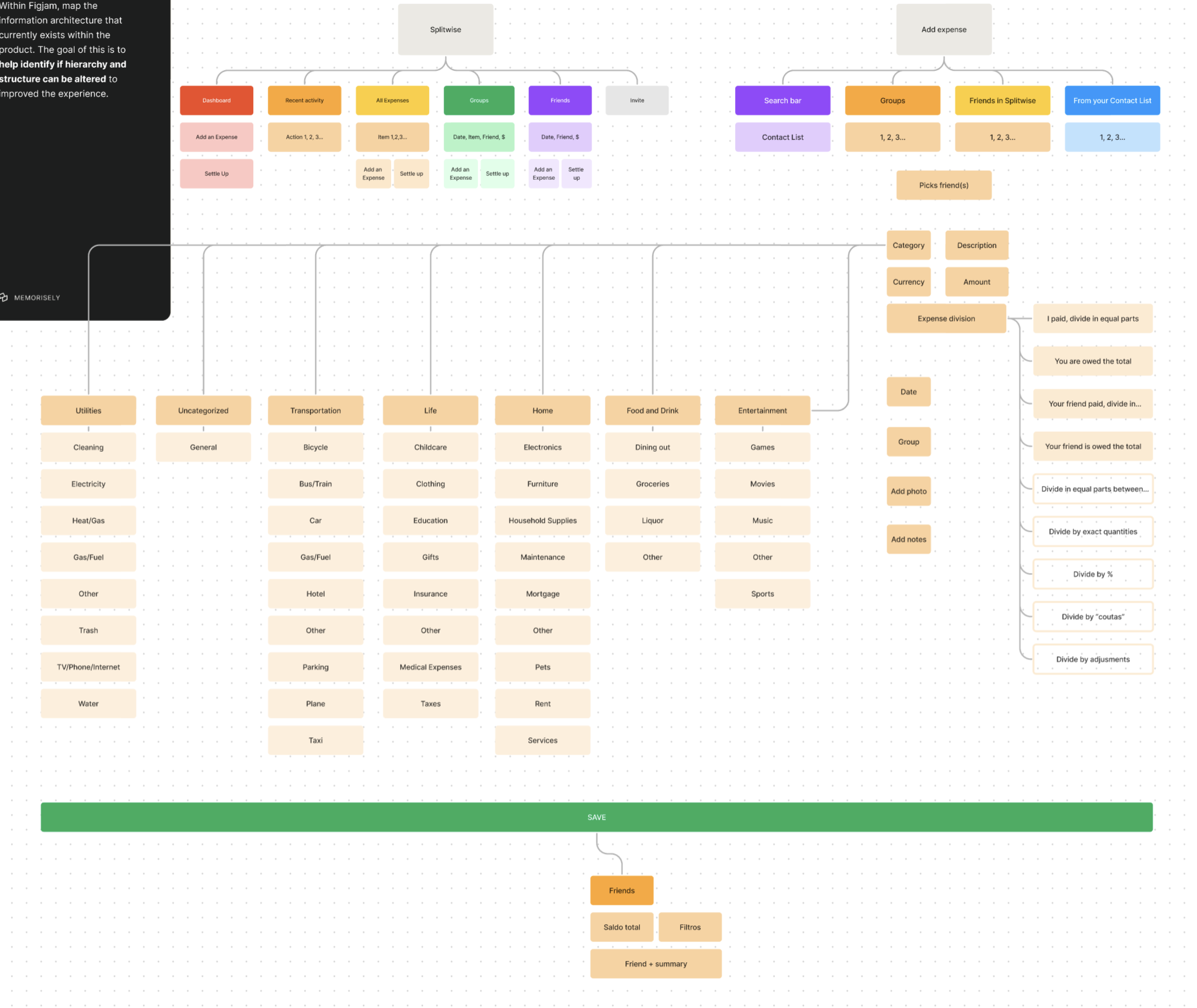
With our insights gathered we mapped the information architecture of the product to gain a better understanding of how we could improve the hierarchy of information.
User Flows
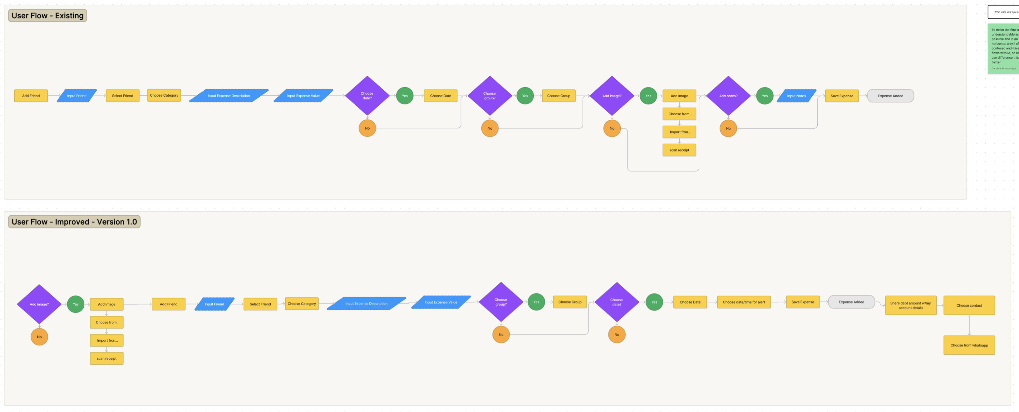
We drafted the exiting user flow about adding an expense and created an improved one.
Rapid Prototyping
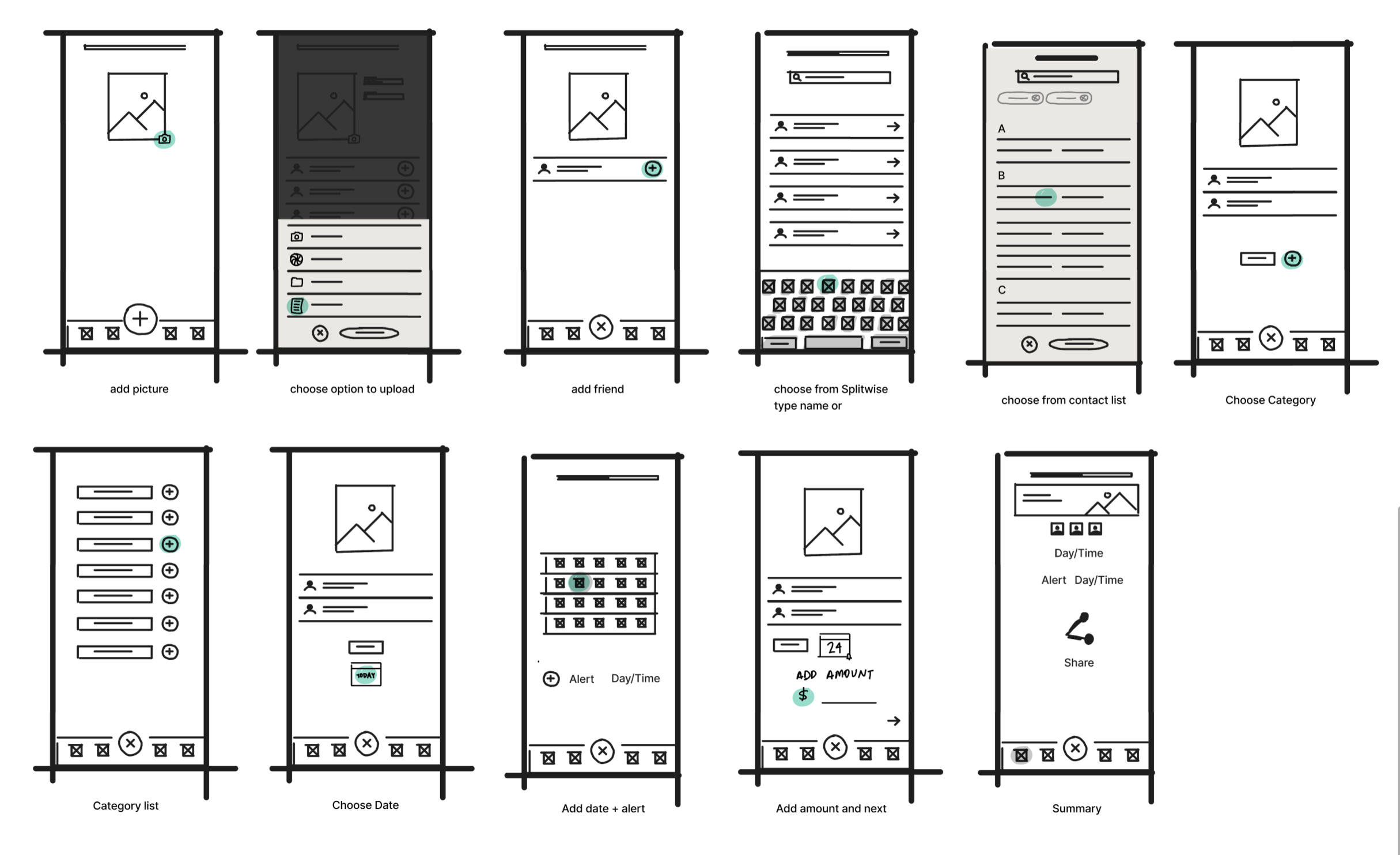
First drafts of our lo-fi wireframe of the improved experience.
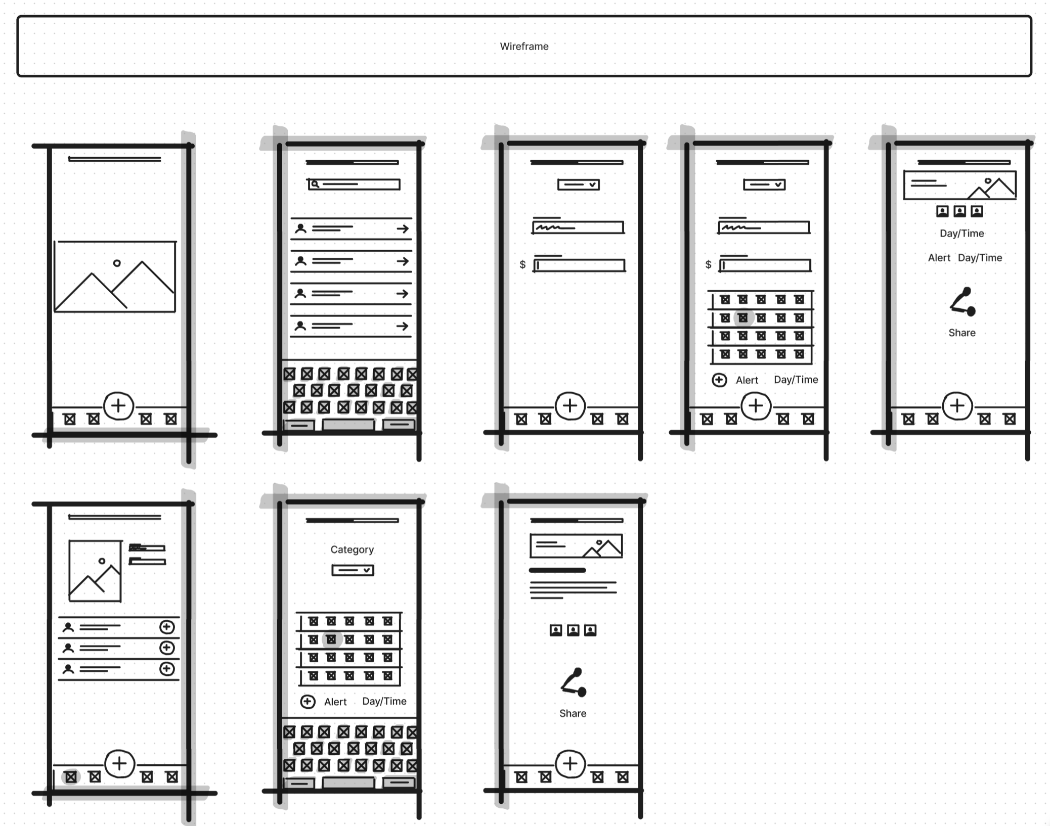
Second lo-fi wireframe of the prototype.
Styles and Components
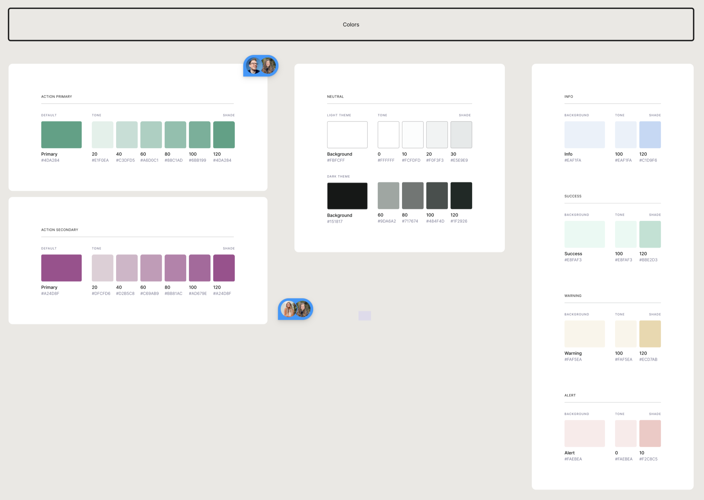
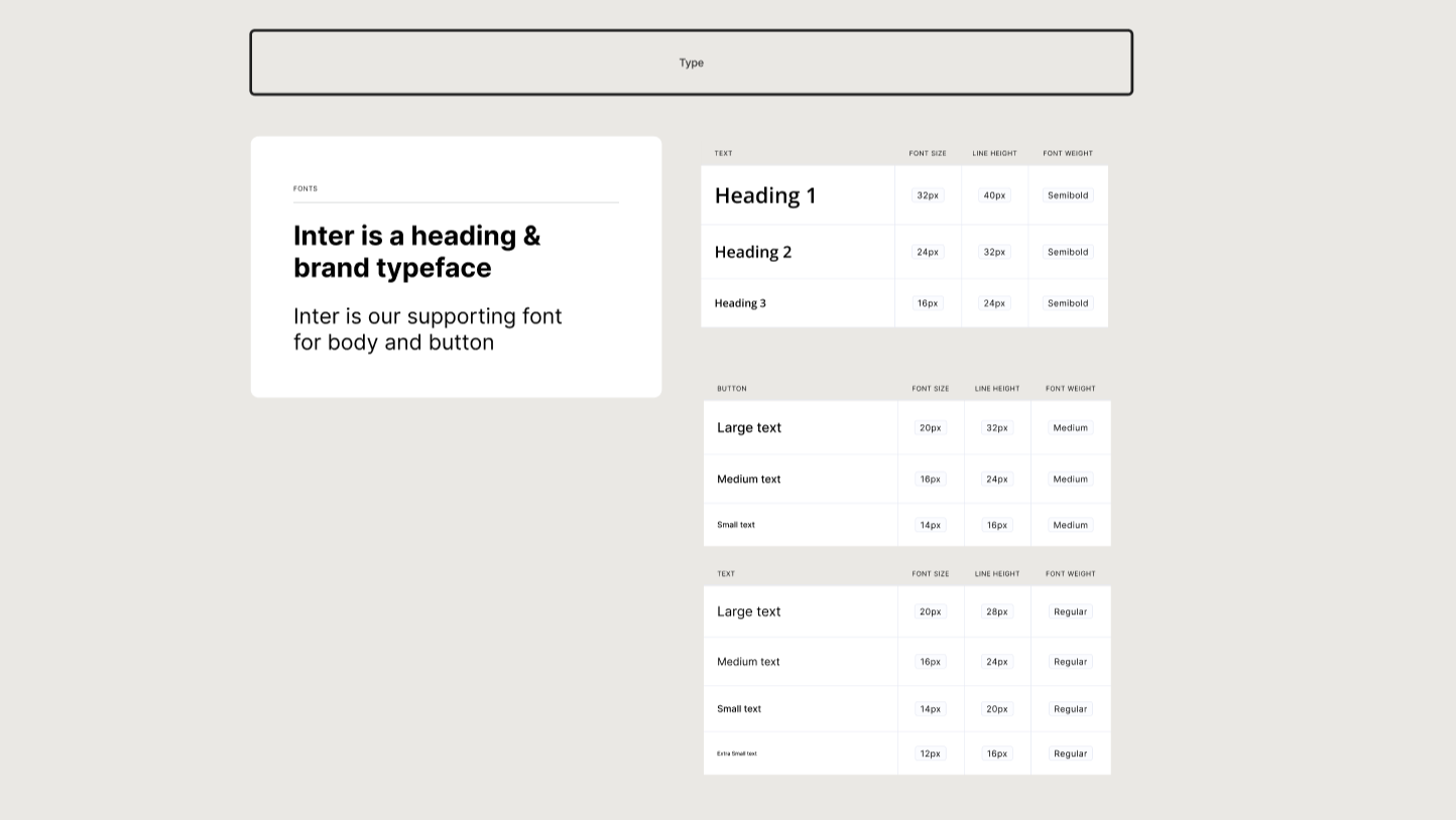
At he final stage we pulled our design into a hi-fidelity prototype. We focused in building out the content first, before adding elements to the screen by using autolayout to make our design responsive.
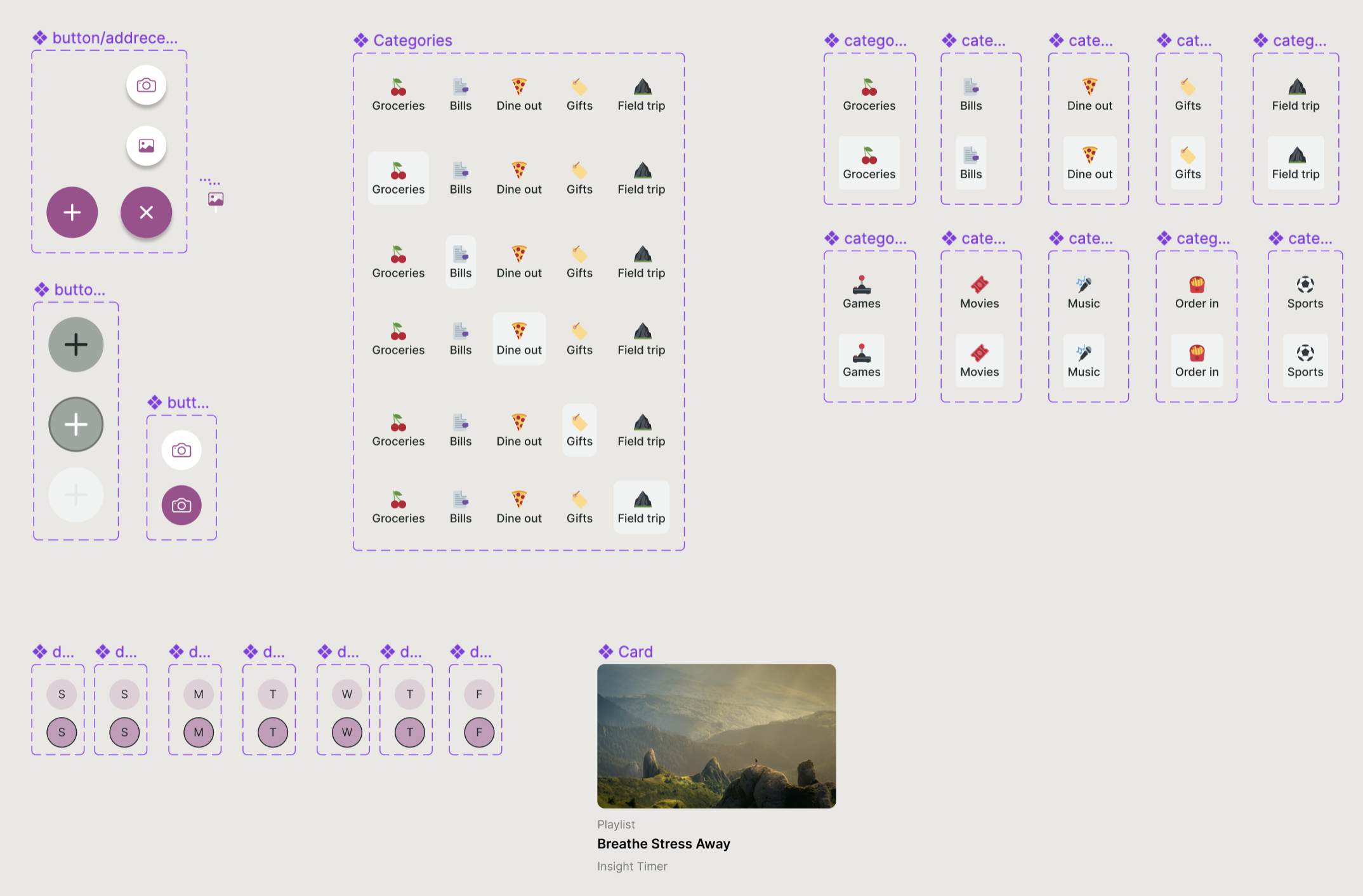
High Fidelity Prototype
Summarise the final prototype that you created…
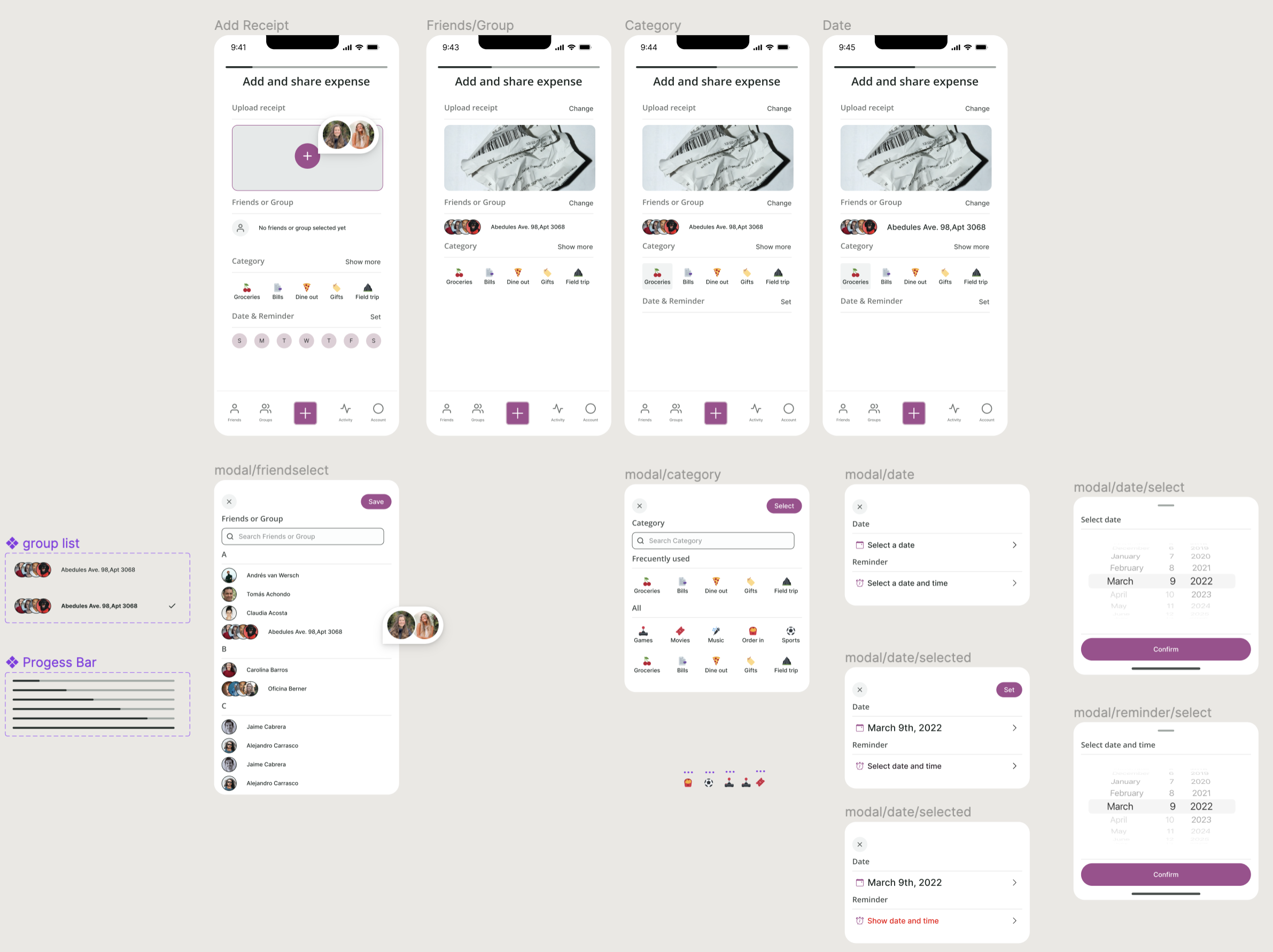
High Fidelity Design
Summarise the final prototype that you created…

Hi-fi Prototype
On development…
