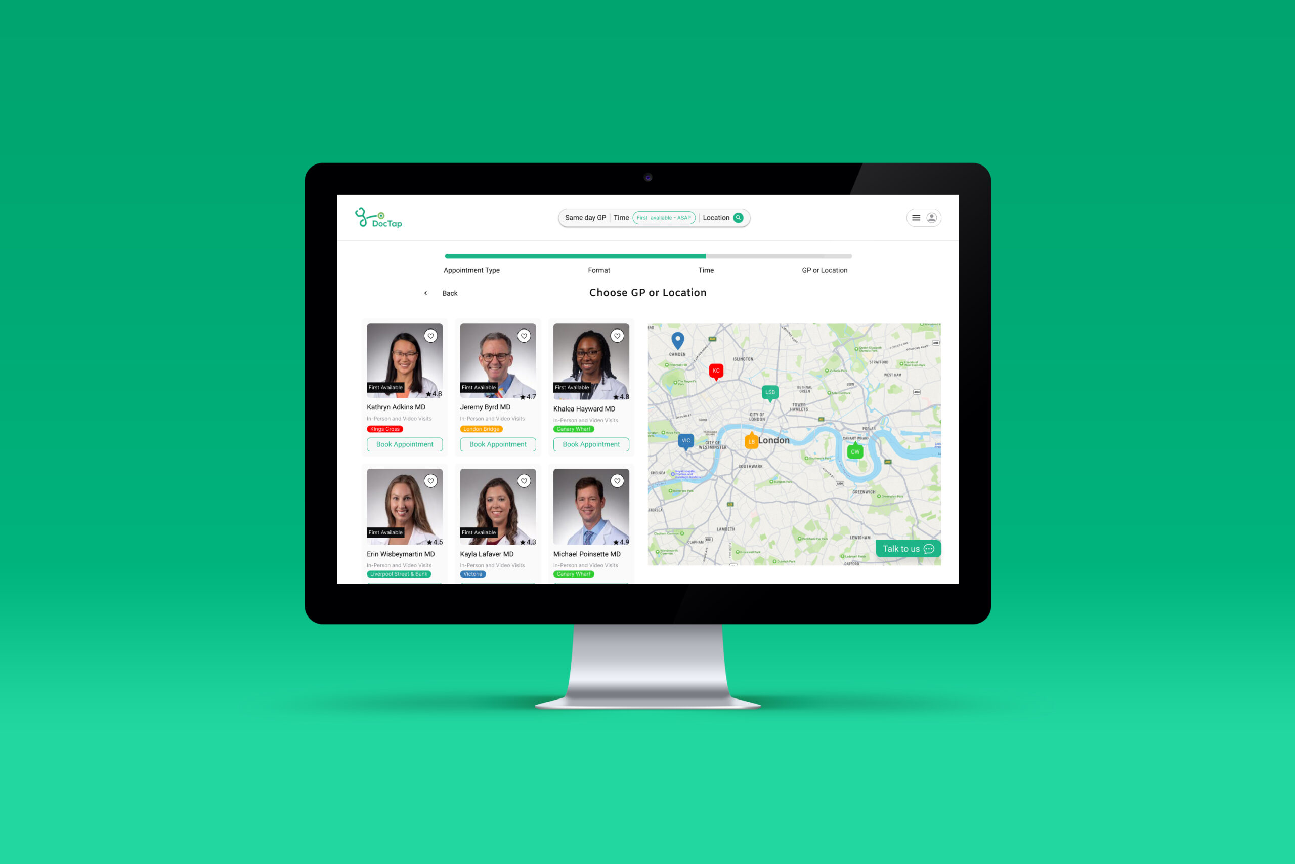
Enhancing the online doctor booking experience for our users.
Based on qualitative research we enhanced the online booking experience on Doctap web app.
Role
UX Research
Tagging Taxonomy and Affinity Mapping
Benchmarking
IA
Wireframing
UI Design
Tools
Zoom
Chat GPT
Dovetail
Figjam
Figma
Maze
Timeline
4 weeks
Interviews
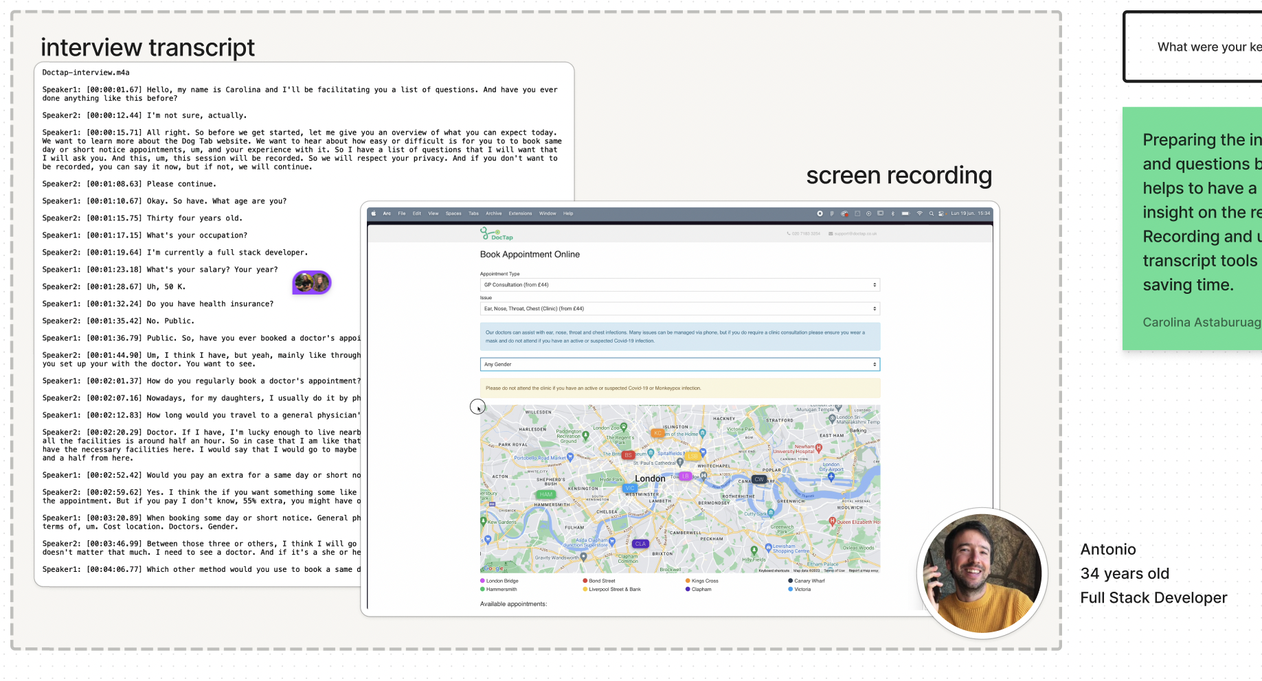
In order to get a better understanding on how the user interacts with DocTap web app we conducted a generative research by interviewing users live and in zoom meetings. With the interviews transcript we asked chatGPT to look for the common pain points of each interview.
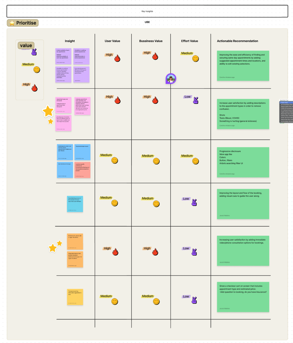
We the ordered the list of key insights by User, Business and Effort Values in order to prioritise our efforts and concluded with actionable Recommendations.
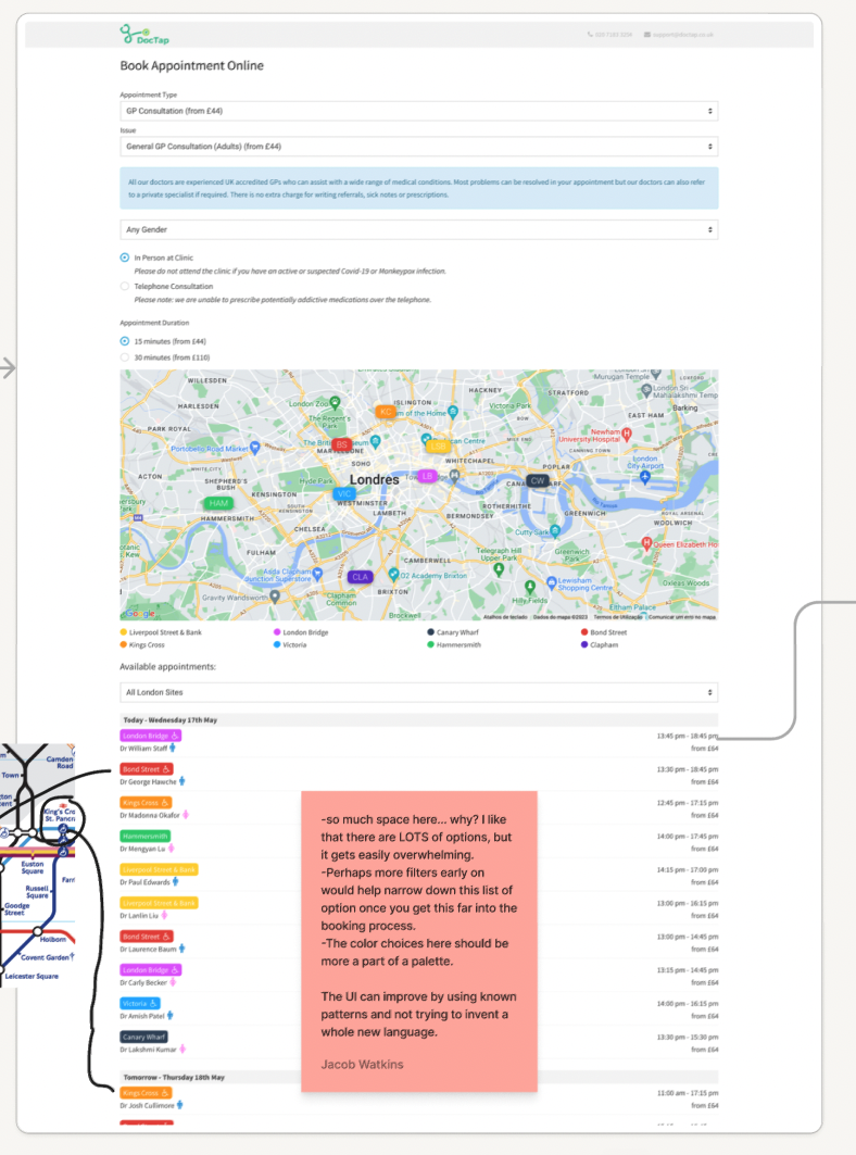
Business & User frustrations
How DocTap can enhance the online doctor booking experience for busy business profesionals by giving clear information about consultations, prices and a fast channel to communicate in urgent situations.
Primary Frustration:
The second list prioritizes clearing up confusion around different appointment types and providing appointment descriptions. This pain point is not explicitly mentioned in the first list. It indicates a focus on improving user understanding and decision-making by providing clear information about the different types of appointments available and their respective purposes.
Secondary Frustration:
In the research the users highlighted the significance of a user-friendly interface and design in enhancing the booking experience. They prioritize addressing issues such as confusing and unclear user interface design, overwhelming amount of text, and lack of visual cues. This reflects the shared understanding that improving the visual appeal, intuitiveness, and clarity of the platform can positively impact user engagement, understanding, and overall satisfaction.
Third Frustration:
While the second list includes a pain point about preference for phone calls in urgent situations, it is not present in the first list. However, the first list emphasizes the goal of enhancing the online doctor booking experience, which can be achieved by integrating features that provide immediate assistance and support for urgent situations. Both approaches recognize the importance of addressing user needs for prompt support and guidance, especially during critical moments.
Competitor Benchmarking
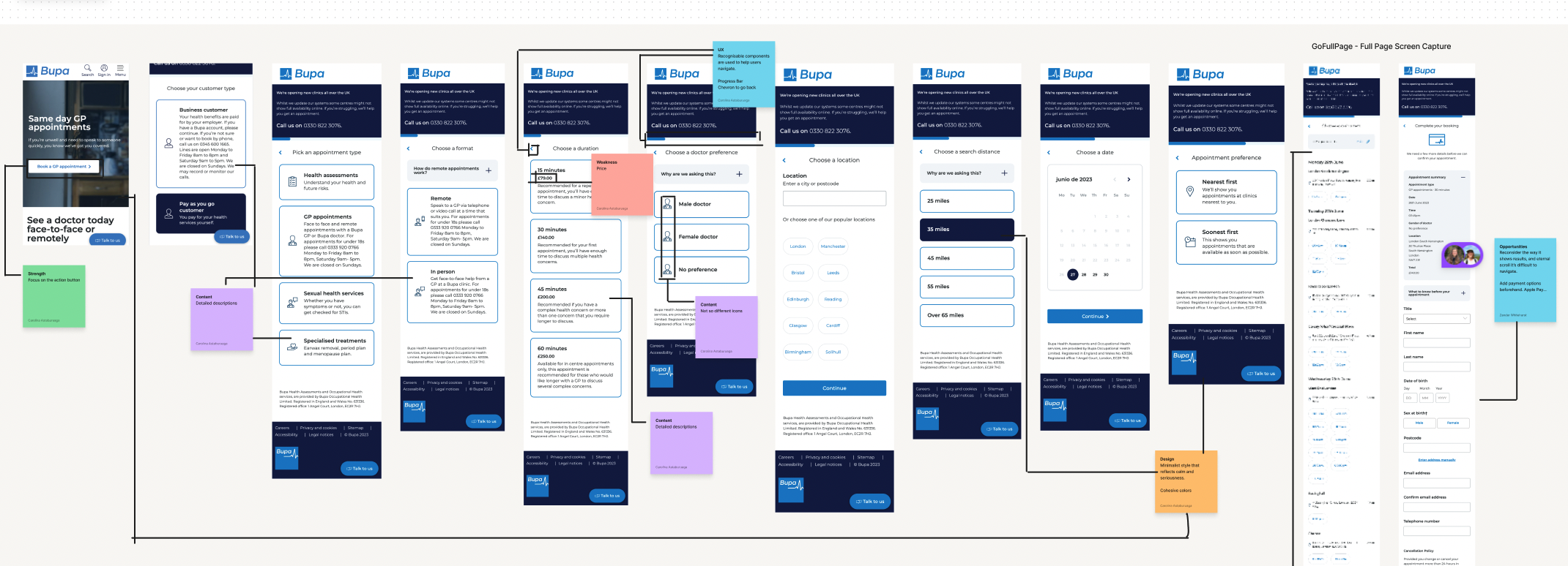
We reviewed a direct and indirect competitor benchmarking to discover the opportunities in their product and find inspiration to enhance our UI and user experience.
Observing features and user flows in a few indirect competitors gave us inspiration for ways to adapt the current experience to benefit our client’s products and meet their business goals.
Ideation
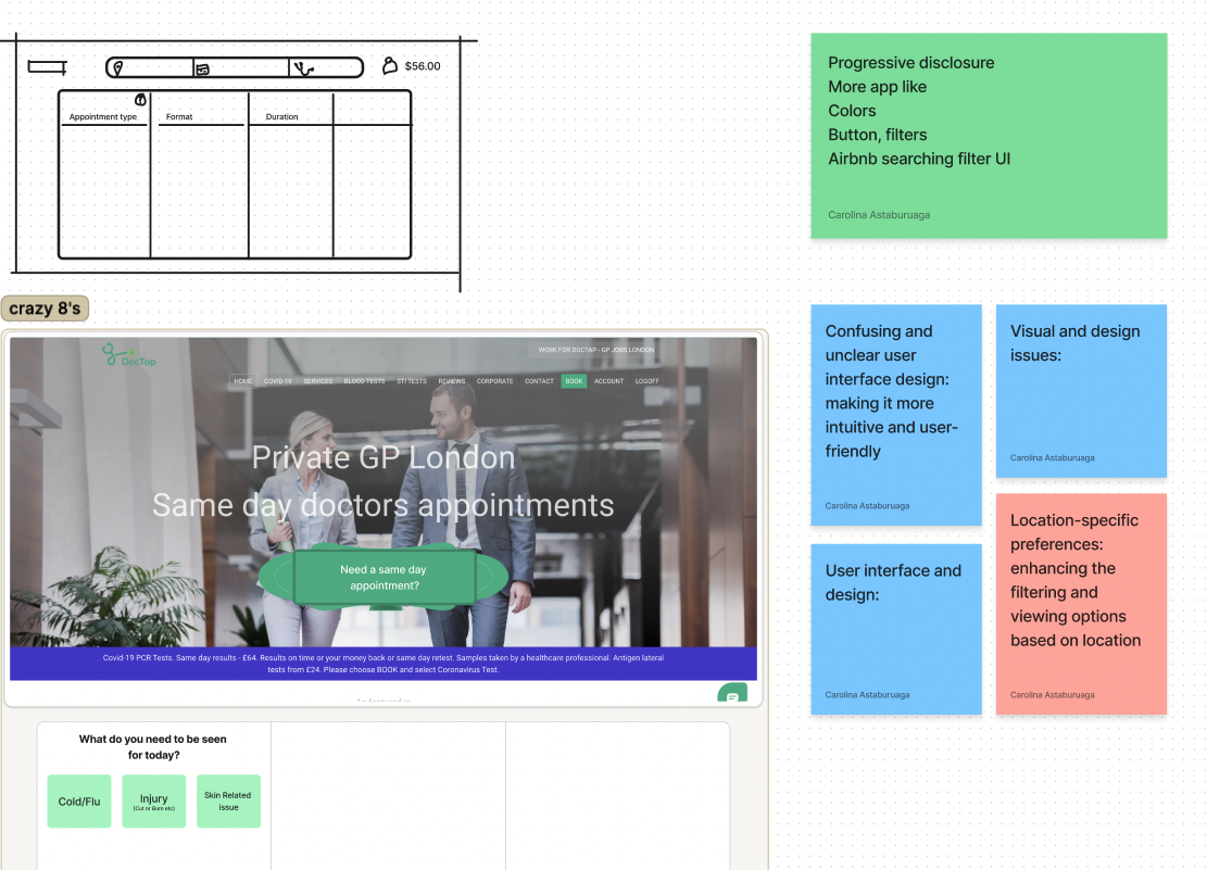
We used the crazy 8s methodology to ideate on the UI and structure of the platform.
Information Architecture
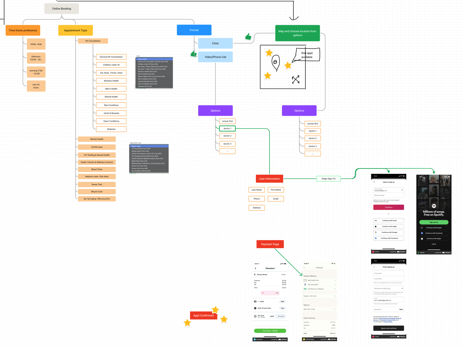
With our insights gathered we mapped the information architecture of the product to gain a better understanding of how we could improve the hierarchy of information.
Rapid Prototyping
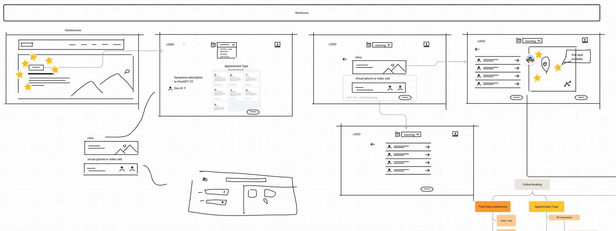
First drafts of our lo-fi wireframe of the improved experience
Variables, Styles and Components
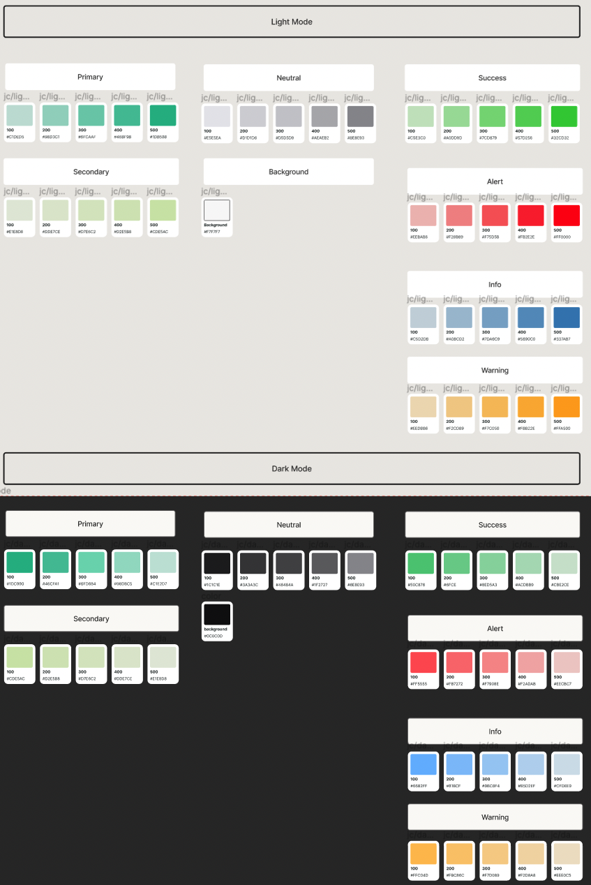
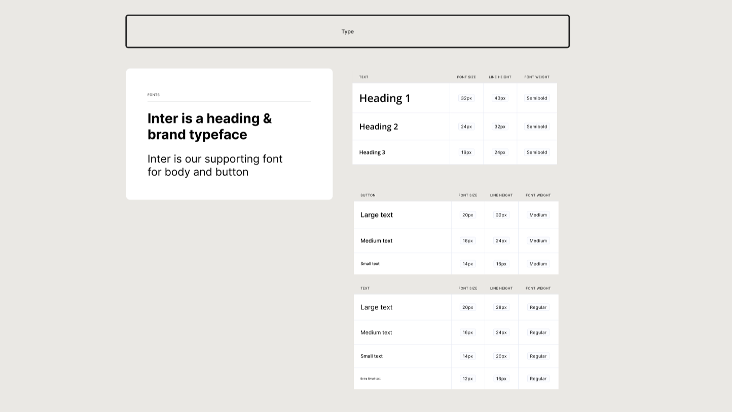
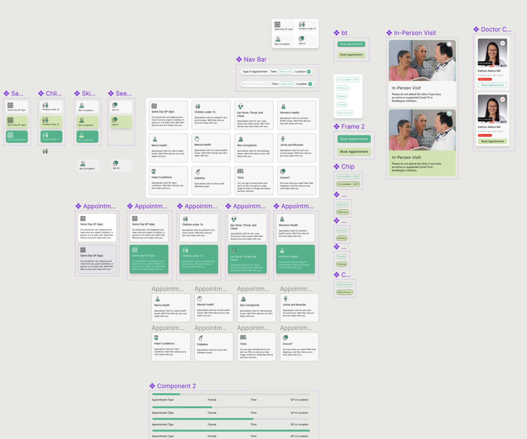
We used Figma Variables in order to apply the new launch in Config 2023 to create our components for Light and Dark mode.
High Fidelity Prototype
In process…
